There are color combinations that are tried and true, combos we just know will “work”. Get out the color wheel and choose colors opposite one another and you know you've got a sure thing. You know what I mean, red and green, pink and turquoise, orange and blue….you get the idea.
Lately I've been seeing the color wheel tossed out the window as papercrafters and scrapbookers keep pushing the creative envelope! This year grey seems to be the “new” neutral and that has been giving pages a totally different flavor as well. Also, many are using the traditional color combos but playing with shade to make the combo fresh.
Here are some color combos that I think are pretty avant garde!
Yellow, Kraft, and Grey (or Yellow and Black)
Michelle Hill recently posted in her newsletter to her monthly kit subscribers that she is in love with the yellow and grey combo. Yellow is so cheery and it really contrasts well against grey and kraft. Using varying shades of each really gives a project depth and warmth at the same time. Here is a page I made using these colors with items from Michelle's Polka Dot Whimsy kits.

Here's another page using grey but with lime and kelly green. Grey is the “new” neutral this year! hehe

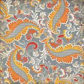
Orange, Yellow, and Grey
This new paper line from Basic Grey blends these colors perfectly! The grey really makes the vibrant yellows and oranges pop.
 Grey, Kraft, and Cream
I am IN LOVE with Anna Griffin's new holiday “Georgette” Collection featuring silvers, greys, kraft, and creams. I bought a huge stack of it at Scrap N Yap and plan to make my Christmas cards with it this year.

Also check out SEI's new Windsor Collection with a similar color combo plus aubergine and mustard yellow:

Red, Black, and Grey/Kraft
Usually you'll see red, black, and white but adding the grey really gives the page a richer feel. And it isn't just for your masculine, hot rod pages either! Try using this for love pages or for a little girl's pictures to really make the photos pop. Or how about for 4th of July?
Today's feature on Daily Inspirations from ScrapBookMate has a page that illustrates this perfectly well. I also recently did a page about our trip to Pasadena using this same combo–it is on diplay at The Scrappin' Table so I haven't had a chance to get a good scan of it yet but you can see it in the store.
Here is a sneak peek at one of the pages for the TWENTY PAGES IN A DAY class Anne and I are teaching at The Scrappin' Table on November 1. This page uses red, black, and kraft combo:


Mustard Yellow, Red, and Navy or Slate
Primary colors usually complement each other but playing with the shades of each can evoke a different feeling than just “school” pages.


Turquoise, Coral, and Black
Check out Jack's World from Cosmo Cricket — many of the journaling cards use this fun and funky color combo. This combo is following the rules being that the colors are on opposite sides of the color wheel but the bright turquoise with the peachy coral is unexpected and whimsical. I am pretty sure I have seen this on beach pages before but it is nice to see it step out of that theme.
Here is a sneak peek of another one of the pages for the TWENTY PAGES IN A DAY class Anne and I are teaching at The Scrappin' Table on November 1:
 Olive Green, Burgundy, and Pink
Love, Elsie's holiday collection last year had this combo but it is cropping up other places now too! It's just a matter of using combining various shades of a traditional color combo (red and green).
Navy, Olive Green, and Black
October Afternoon's new Hometown Collection has this combo plus a little yellow thrown in:

Making Memories' 5th Avenue Collection also had a similar color combo.'
Red, Orange, and Turquoise/Teal
Glitz released an entire paper line using these colors and Dream Street Papers' “Menagerie”collection combines these with purple as well. Here is a page I did with the Glitz papers.

So, try one of these different color combos out yourself! Post a link to your creation here in the comments section by Friday night Oct 10th. It doesn't have to be new–just share a page you think uses an avant garde color combo. I'll draw one winner randomly to win a goodie bag!! Please be sure to leave me some way to contact you as well.
Now for the potato. As I was typing out this blog post Matthew started messing with the plugs for the TV and the satelite receiver. He managed to pull the satelite receiver down onto the floor. He is obsessed with plugs and outlets right now. Anyways, I went to fix what he had just done and went to plug the receiver back in when I see an amoeba-like shape behind the TV. At first I thought it was one of Matt's shoes since he is really into throwing stuff now too. Nope. It was a red potato. In my bedroom, behind the TV. Thank goodness I found it now, before it started to rot or something. Last weekend Matthew came into our bedroom with a couple potatoes he got out of the pantry. He was hungry and wanted us to make him breakfast since we were trying to have a lazy morning of staying in bed. Anyways, I guess he must have stashed that potato behind the TV just in case he got hungry again! LOL Boys are soooooo much different than girls. With Matt everyday is an adventure and the only thing left to do is laugh because the stuff that goes on is just so unbelieveable and incredible it is bewildering. He has been spending alot of time in purgatory right now beccause I can't get anything done if he is “loose”. Here's a pic I took of him this AM–he loves the camera!!

He is just way to cute…
How can you stand it? Love that age….they are alwasy discovering something!!!
Oooooh! Love all of these color combos! And your little Matt is absolutely adorable. They change so fast at this age. :)
I just love those gnome layouts! It cracks me up how Matthew loves to play with that guy… I don’t know if you have Matthew’s halloween costume yet, but I saw the cutest home made gnome costume idea in the October 2008 issue of Family Fun. It reminded me of Matthew. Just adorable!
Matt is just way too funny and cute!! Love those color combos, I may have to try them out…My list gets longer and longer of things to scraplift or try from you!! too bad the days don’t get any longer!!
What a cutie matt is!! Poor wee mannie put in purgatory so you can scrap in peace!! LOL The results of this are amazing so I guess its OK!! :)
love all those unexpected color combos too. maffew is such a cutie… i miss that stage when kaden’s cuteness factor overrided his monsterness!! i don’t know if those are actually words but you know what i mean!!!
Loving all teh color combos you posted and your pages are rockin :) Awesome job!